Rebranding
Restyling the look & feel for this high-end project interior office. From stationary to website.
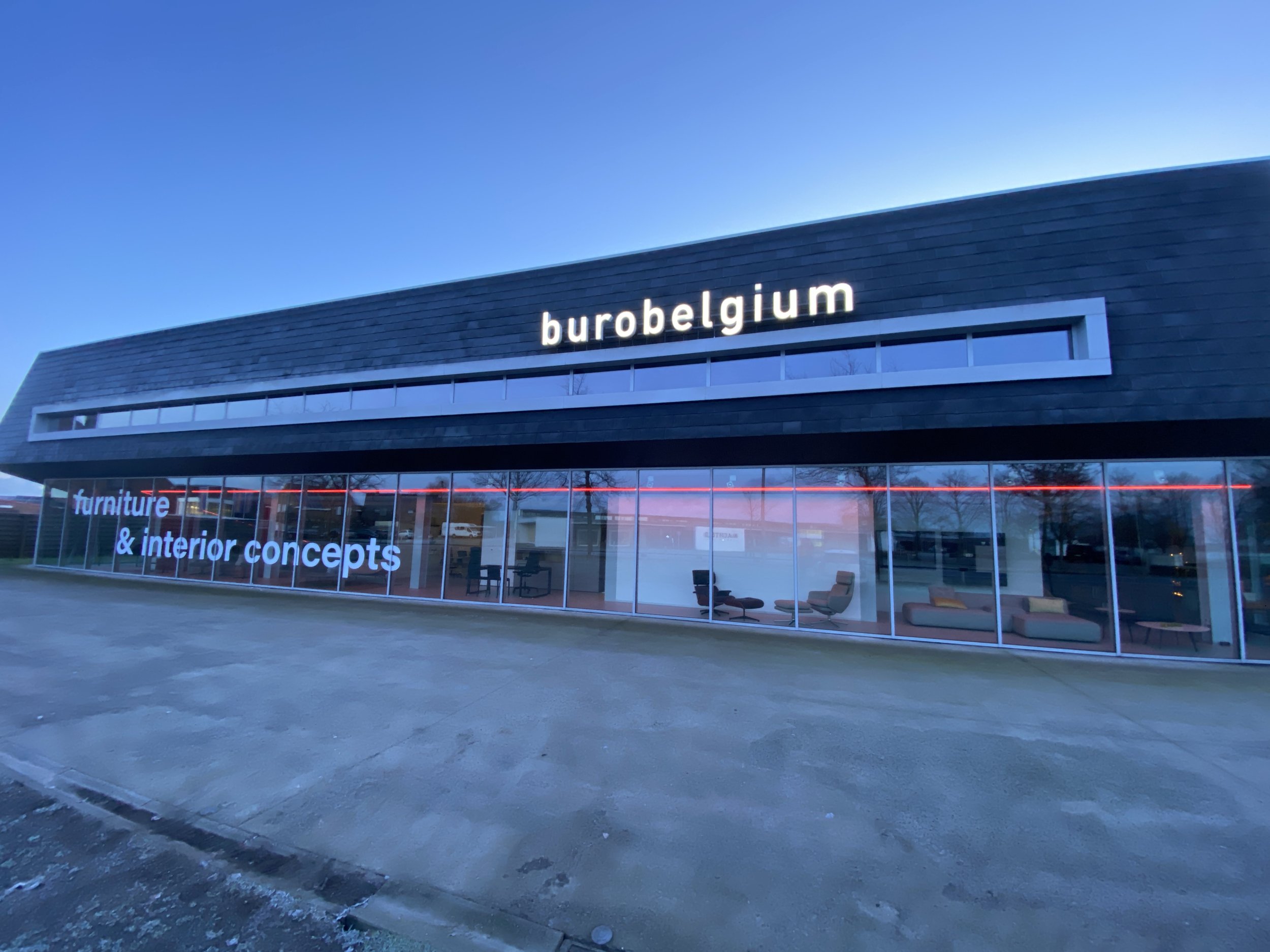
Starting from a blank page with the old mind-mapping tricks, we came up with a beautiful blend where the red color is the ‘rode draad’ in every communication.
Keeping space for visual communication (pictures, logo's, …) and disproportioning the current logo.
Now their story can be told with every little aspect matching.